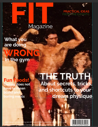
 I purposely kept my masthead bold and simple. I want my readers to really understand that this magazine is different from other health and fitness magazines. This magazine will be devoid of all the industry noise and garbage that these types of magazines usually contain. This magazine will be special: no B.S. advice and practical guides to staying healthy through proper dieting and working out. I have not settled on a final font yet, but again, I wanted to keep things simple with all the lettering to further push my no B.S. message. The photo I have selected is an old photo from when my girlfriends father won a bodybuilding competition. I immediately knew this would be a perfect choice and it was easy to get his permission to use the photo -- It's not every day that we get to meet and have rights to a picture of someone like that.
0 Comments
Leave a Reply. |
AuthorWrite something about yourself. No need to be fancy, just an overview. Archives
April 2021
Categories |
 RSS Feed
