   The reason I chose these layouts is their simplicity -- they get straight to the point. This correlates directly with the theme of "no B.S." information that I want to maintain in my magazine. My magazine is going to be educational and professional when it comes to health and fitness, and I want my TOCs simple and straight-to-the-point nature to reflect that.
Possible Topics: Common gym mistakes Real eating guide Debunking fitness myths Scientific study analysis Bodybuilding: then vs. now
0 Comments
After looking at my response and the example response side-by-side, it is clear that I have a lot of learning to do. I saw a few of the things mentioned in the example notes, but missed many more. Little things such as the noises that the washing machine was making and the timing of those noises. I did notice that my point about the delay in Lester's wife's bleeding was missed in the example response was missed in the example response, but this could be because I was completely wrong about this -- although still interesting to think about. All in all, there were many little things that I missed this time around, but I am confident that I will do better on the next one, now that I know exactly what I am looking for.
My Notes: -Panning in the beginning to establish scene -top-down view of body -Suspenseful music -dim lighting -dull colors -quiet environment -delay in bleeding My Response: The camera angles vary throughout the scene, beginning with an establishing shot when Lester’s wife enters the house, showing a dark scene with dull colors, establishing an eerie tone. When she is down in the basement speaking with Lester, we are mostly met with over the shoulder shots during their conversation, this allows us to feel as if we are a part of the conversation and empathize with the characters, seeing everything from their point of view. After Lester kills his wife with the hammer, we see her dead body from a top-down view. With this, the filmmakers wanted to make sure we knew the exact scale of what Lester had just done. To add suspense, music was playing to fit the tone of the scene. When Lester was loading his gun, the clinking of the bullets added even more suspense as it made it obvious that his hands were trembling. It is meant to stress the audience out, so we can feel what lester feels. From the moment the scene opened, it was obvious that something bad was going to happen. Dim lighting in combination with dull, neutral colors began to stir the pot of nervousness within the audience. As we continue into the basement, nothing really changes. The lack of background noise, dull colors, and dim lighting all contribute to the stressful and nervous atmosphere of the scene. In terms of editing, one notable thing was the blood. Lester’s wife began to bleed only after a short delay, putting us in Lester’s shoes, as we only see her bleed as the realization that he killed her dawns on him. Had she bled earlier, we would have known that the blow was very serious before Lester realized what he had done. This slight delay allowed us to empathize with Lester, making us feel more a part of the scene. 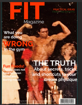 I purposely kept my masthead bold and simple. I want my readers to really understand that this magazine is different from other health and fitness magazines. This magazine will be devoid of all the industry noise and garbage that these types of magazines usually contain. This magazine will be special: no B.S. advice and practical guides to staying healthy through proper dieting and working out. I have not settled on a final font yet, but again, I wanted to keep things simple with all the lettering to further push my no B.S. message. The photo I have selected is an old photo from when my girlfriends father won a bodybuilding competition. I immediately knew this would be a perfect choice and it was easy to get his permission to use the photo -- It's not every day that we get to meet and have rights to a picture of someone like that.
|
AuthorWrite something about yourself. No need to be fancy, just an overview. Archives
April 2021
Categories |
 RSS Feed
